지난번 글에서 Flutter의 기본 구조에 대해서 알아보았다.
[Flutter] (3) Dart의 기본 구조 알아보기
[Flutter] (2) 애뮬리이터 설치하기, 앱 빌드 및 웹 빌드 이번 글에서는 Flutter에서 개발한 코드를 안드로이드 애뮬레이터, 실제 스마트폰, 그리고 웹에서 빌드해볼 수 있는 세팅을 진행 할 것이다.
hwanho-log.tistory.com
지난번 글에 이어서 이번 글에서는 front-end 디자인을 하는 방법에 대해서 알아보려고 한다.
import 'package:flutter/material.dart';

void main() {
  runApp(const MyApp());
}

class MyApp extends StatelessWidget {
  const MyApp({super.key});
  // This widget is the root of your application.
  @override
  Widget build(BuildContext context) {
    return MaterialApp(
      title: 'Flutter Demo',
      theme: ThemeData(
        colorScheme: ColorScheme.fromSeed(seedColor: Colors.deepPurple),
        useMaterial3: true,
      ),
      home: const MyHomePage(),
    );
  }
}

class MyHomePage extends StatelessWidget {
  const MyHomePage({super.key});

  Widget build(BuildContext context){
    return Scaffold(

    );
  }
}
지난번 글에서 위와 같은 flutter의 기본 코드를 작성하였고, 여기에 디자인적 요소들을 더하려면 return Scaffold 부분에 원하는 것들을 추가하면 된다고 하였다.
Scaffold에서 사용할 수 있는 함수로는 아래와 같은 것들이 있다.
  const Scaffold({
    super.key,
    this.appBar,
    this.body,
    this.floatingActionButton,
    this.floatingActionButtonLocation,
    this.floatingActionButtonAnimator,
    this.persistentFooterButtons,
    this.persistentFooterAlignment = AlignmentDirectional.centerEnd,
    this.drawer,
    this.onDrawerChanged,
    this.endDrawer,
    this.onEndDrawerChanged,
    this.bottomNavigationBar,
    this.bottomSheet,
    this.backgroundColor,
    this.resizeToAvoidBottomInset,
    this.primary = true,
    this.drawerDragStartBehavior = DragStartBehavior.start,
    this.extendBody = false,
    this.extendBodyBehindAppBar = false,
    this.drawerScrimColor,
    this.drawerEdgeDragWidth,
    this.drawerEnableOpenDragGesture = true,
    this.endDrawerEnableOpenDragGesture = true,
    this.restorationId,
  });
이 외에도 아래 웹사이트를 통해서 flutter를 사용하여 구현할 수 있는 컴포넌트들과 사용 방법 (코드)를 확인할 수 있다.
https://gallery.flutter.dev/#/
Flutter Gallery
Google uses cookies to deliver its services, to personalize ads, and to analyze traffic. You can adjust your privacy controls anytime in your Google settings. Learn more. Okay
gallery.flutter.dev
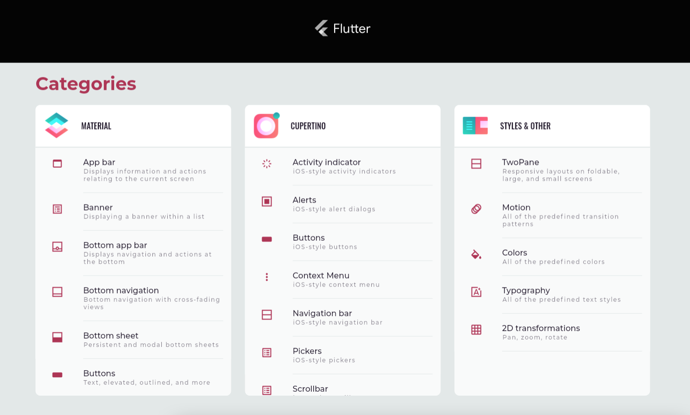
Material 부분은 Andriod 베이스의 UI이고, Cupertino는 ios 베이스의 UI이다.
Flutter의 UI디자인 형식은 child와 children을 사용해서 하위 트리를 만들어 UI를 쌓아 올리는 형식이다.
이론만 계속 공부해서는 이해가 안되는 부분이 있어서, 실제 프론트엔드 화면을 하나 만들어보기로 했다.
가장 먼저 backgroundColor을 넣는 방법이다.
Scaffold()안에다가 backgroundColor: 이후 원하는 color을 설정해주면 된다.
  Widget build(BuildContext context){
    return Scaffold(
        backgroundColor: Colors.black,
        backgroundColor: const Color.fromARGB(255, 136, 194, 223),
      );
  }
}
물론 가장 쉬운 방법은 backgroundColor: Colors.색상이름으로 설정을 해주는 것이겠지만, 더 자세한 색상 선택을 위해서 Colors 옆에 뜨는 사각형 색상을 클릭하여 더 자세한 색상을 선택하여 줄 수도 있다.
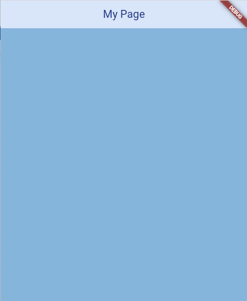
이제 Appbar을 제작하여 주려고 한다.
Appbar 또한 Scaffold안에다가 backgroundColor을 선택한 것 처럼 해주면 된다.
  Widget build(BuildContext context){
    return Scaffold(
        backgroundColor: const Color.fromARGB(255, 136, 194, 223),
        appBar: AppBar(
          backgroundColor: Color.fromARGB(255, 219, 234, 248),
          title: Text('My Page', style: TextStyle(color: Color.fromARGB(255, 1, 71, 136))),
          centerTitle: true
        )
      );
  }
Appbar 안에서도 많은 속성을 지정할 수 있는데, 왠만한 속성들은 대충 비슷한 키워드를 적어보면 추천으로 나올때가 많고, 원하는 속성은 구글링을 해서 빠르게 찾아 넣을 수 있을 것이다.
위 코드까지 작성을 완료하면 아래와 같은 결과물이 나온다.
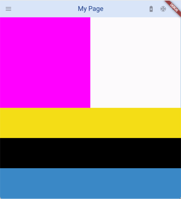
이제 Appbar에 아이콘을 몇개 추가해줄텐데, Appbar에는 2가지 지정된 아이콘 형식이 존재한다.
Leading과 action인데, 주로 leading은 왼쪽에 위치하여 메뉴바 생성등의 역할을 수행하고, action은 오른쪽에 위치하여 특정한 기능을 수행한다. (ex. 검색기능 등)
 Widget build(BuildContext context){
    return Scaffold(
        backgroundColor: const Color.fromARGB(255, 136, 194, 223),
        appBar: AppBar(
          backgroundColor: Color.fromARGB(255, 219, 234, 248),
          title: Text('My Page', style: TextStyle(color: Color.fromARGB(255, 1, 71, 136))),
          centerTitle: true,
          leading: IconButton(icon: Icon(Icons.menu),onPressed: null),
          actions: [
            IconButton(icon: Icon(Icons.battery_saver),onPressed: null),
            IconButton(icon: Icon(Icons.ac_unit),onPressed: null),
            IconButton(icon: Icon(Icons.hls),onPressed: null),
          ],
        )
      );
  }
위 코드와 같이 icon을 추가해줄 수 있다.
Icons. 경로에는 기본적으로 정말 다양한 아이콘들이 준비되어 있는데, 다음 링크를 통해서 어떠한 종류의 아이콘들이 존재하는지 확인할 수 있다.
https://fonts.google.com/icons
Material Symbols and Icons - Google Fonts
Material Symbols are our newest icons consolidating over 2,500 glyphs in a single font file with a wide range of design variants.
fonts.google.com
이제 본격적으로 body를 꾸며보도록 하겠다.
body에서는 기본적으로 크게 3가지 개념을 알고 있어야 디자인을 하기 수월하다.
(아래에서 컴포넌트라고 지칭하는 것은 검색창, 버튼, 텍스트 등을 모두 포함한 것이다)
1. child & children
이 함수들은 어떠한 컴포넌트와 다른 컴포넌트 사이의 상하위 관계를 지정하는 함수이다. 즉, 어떤 컴포넌트 안에 어떤 컴포넌트가 들어있는지를 알려주는 함수라고 생각하면 편할 것 같다.
물론 child는 하위에 한가지 컴포넌트만 있을 때 사용하고, children은 하우에 여러가지 컴포넌트가 있을 때 사용한다.
2. Row & Column
Row와 Column 함수는 화면을 가로 또는 세로로 나눌 때 사용한다.
보통 children을 사용하여 나누는 구역에 해당하는 컴포넌트들을 생성한다.
각각의 Row & Column 마다 설정값을 통해 크기, 색상등을 조절할 수 있다.
(Row는 위에서 아래로 구분줄이 그어지고, Column은 좌우로 구분줄이 그어진다고 생각하면 편하다.)
3. Container
컨테이너는 특정한 부분을 선택하여 디자인하는 기능이다.
HTML로 비유하면 <div> 태그 정도로 이해할 수 있을 것 같다.
단, Container은 children을 가질 수 없고, child만 가질 수 있다는 것을 유의해야 한다.
컨테이너는 화면을 나누는 분할의 기능보다는 특정한 지역을 디자인하는데 더 특화가 되어있음으로, 주로 Row나 Column의 하위에서 사용될 때가 많다. (물론 큰 컨테이터를 만들고 그 하위에 Row 나 Column을child로 사용할 수도 있다.)
Container은 다음과 같이 사용될 수 있다.
이 세가지 개념을 조금 더 잘 이해하기 위해서 각 구역을 색상으로 나누어 보면서 개념을 더 자세히 익혀보도록 하겠다.
class MyHomePage extends StatelessWidget {
  const MyHomePage({super.key});

  Widget build(BuildContext context){
    return Scaffold(
        backgroundColor: const Color.fromARGB(255, 136, 194, 223),
        appBar: AppBar(
          backgroundColor: Color.fromARGB(255, 219, 234, 248),
          title: Text('My Page', style: TextStyle(color: Color.fromARGB(255, 1, 71, 136))),
          centerTitle: true,
          leading: IconButton(icon: Icon(Icons.menu),onPressed: null),
          actions: [
            IconButton(icon: Icon(Icons.battery_saver),onPressed: null),
            IconButton(icon: Icon(Icons.ac_unit),onPressed: null),
            IconButton(icon: Icon(Icons.hls),onPressed: null),
          ],
        ),
        body: Column(
          children: [
            Container(
              height: 300,
              child: Row(
                children: [
                  Container(color: const Color.fromARGB(255, 255, 64, 252), width: 300,),
                  Container(color: Color.fromARGB(255, 252, 251, 252), width: 300,)
                ],
              ),
              ),
            Container(color: Colors.amberAccent, height: 100,),
            Container(color: const Color.fromARGB(255, 0, 0, 0),height: 100),
            Container(color: Color.fromARGB(255, 25, 155, 202),height: 100)
          ]
        ),
      );
  }
}
나는 다음과 같은 코드를 통해서 아래의 결과를 만들어내었다.
이와 같이 Row & height, child & children, Container을 통해서 화면을 나누고 분리하여 원하는 UI를 만들어낼 수 있다.
하지만 위의 화면을 만들면서 한가지 아쉬웠던 것은 화면 사이즈에 따라서 변화하지 못한다는 것이다.
Container의 height 또는 width를 숫자로 설정해주었기 때문에 화면의 사이즈가 줄어들 경우 아래와 같이 화면 UI에서 에러가 뜨는 것을 확인할 수 있었다.
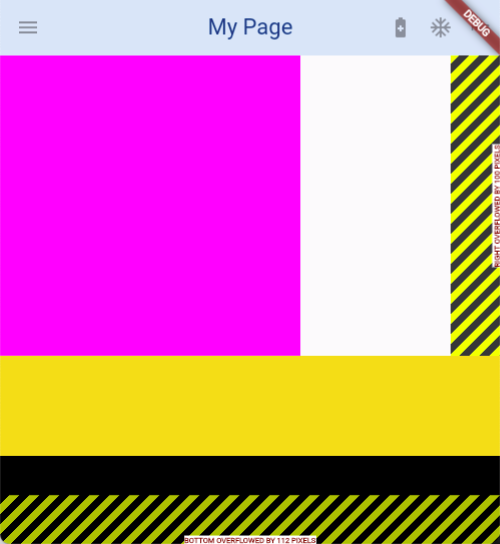
화면이 커졌을 때 또한 빈 배경화면만 추가적으로 나올 뿐이다.
이러한 문제를 해결하기 위해서 다음 글에서는 MediaQuery를 사용해보도록 하겠다.
[Flutter] (5) MediaQuery, LayoutBuilder, OrienataionBuilder 사용하기
지난번 글에서는 Flutter을 이용하여 기본적인 프론트엔드 디자인을 하는 방법을 알아보았다. [Flutter] (4) 프론트엔드 디자인 하기 (Front-end Design) 지난번 글에서 Flutter의 기본 구조에 대해서 알아보
hwanho-log.tistory.com


